
Podcast: Play in new window | Download
Subscribe: Apple Podcasts | Spotify | Pandora | RSS | More
Synopsis
Just as you would make your book’s cover as attractive as possible, your sell sheet must also leave readers with a favorable first impression of you and your new book. Following these key design principles for your book’s sell sheet will pay off with higher book sales.

What You Will Learn
1. You will learn what design elements your sell sheet must utilize in order to create a favorable first impression.
2. You will learn about the importance of white space, and not overusing color.
3. You will learn how using the appropriate fonts and high-quality images will help make your sell sheet look professionally done.
Introduction
Just as you would make your book’s cover as attractive as possible, your sell sheet must also leave readers with a favorable first impression of you and your new book. Unfortunately, very few readers will do any more than skim the sell sheet to find only the information they are searching for.
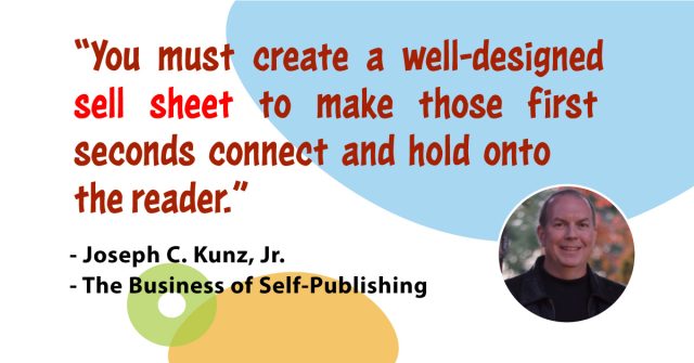
Therefore, you must make sure that you’ve created an attractive, well-designed sheet to make those first few seconds connect and hold onto the reader. Even if you can’t afford to hire a professional designer for your marketing materials, following these five key design principles will pay off with higher book sales.
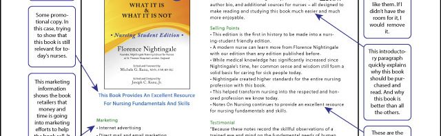
Key # 1. Use Columns And Text Boxes
Divide your page into two or three columns because short spans of text are much easier to read and more visually appealing than long lines. It’s also a good idea to consider using text boxes. These are a great way to highlight or separate, specific information about your book.
Key # 2. Use Plenty Of White Space
Text and graphics stand out much better when they have some blank space, or breathing room, around them. As a general rule, make sure you have at least a one-half inch margin on all four sides of your sheet and leave one-quarter-inch space between columns and other graphics. And remember that it’s better to eliminate some text than cram too much onto the page.
Key # 3. Use Color Sparingly
More color is not necessarily better. Color can be used to draw the reader’s attention, but if it is overused it can easily become too chaotic and overwhelming. You must remember that using white space can be far more effective because it draws focus to what you want to highlight and gives the reader’s eye a rest.
White space will also help keep your sell sheet easy to navigate and keep it clean-looking. As far as text is concerned, you should also keep most of your text the same color. While you may want to make a few keywords or phrases jump off the page by using colors or fancy fonts, if you try to make too much pop out, nothing will.
Key # 4. Use Appropriate Fonts
Use a maximum of two typefaces. Use a serif font (such as Times New Roman) for text. Use sans serif (such as Arial) for headlines and captions. Serif fonts are easier to read and look cleaner and more modern. Avoid using fonts that are too difficult to see. Use sans serif, for example, if you’re going to be using very small text. But don’t be afraid to experiment with different fonts.
Key # 5. Use High Quality Graphics And Photographs
Invest in good photography and artwork. Even if a photo looks good online, this doesn’t mean it’ll look good in print. Use high-resolution photography that is at least 300 dpi. Any resolution lower than this won’t look good in print.
If you can’t take your own photos or use professional photography, purchase stock photography online. It’s inexpensive and a much better alternative to using clip art. Clip art may be inexpensive but will make your sell sheet look low-budget.
Conclusion
If you stick to these basic design principles, you’ll be well on your way to creating a sophisticated and effective one-page sales sheet that you can proudly distribute to current and potential customers, book reviewers, and book distributors – and no one will ever know that you didn’t hire a professional designer to create it.
Questions For Us To Think About And Discuss
1. Do you understand what a sell sheet is, and how and why to use one?
2. Do you have a sell sheet for your book? If no, why not?